LANDSCAPE HORTICULTURE CERTIFICATION PROGRAM

FULL BRANDING & PRINT DESIGN
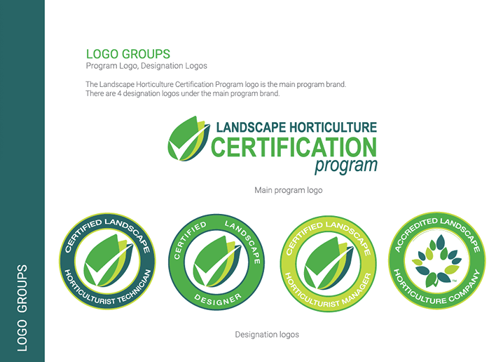
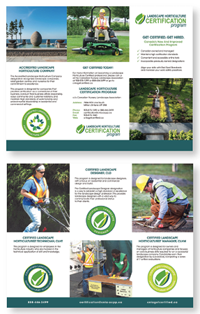
This material was created in collaboration with the Bare Bones Marketing team. The brand identity is designed to set an organization’s program or product apart in the eyes of the public, stakeholders, and the community. The logo features an imagery of three leaves, representing nature and the landscaping industry, along with a checkmark to signify program certification. Additionally, the same imagery is used in their Designation logos but with typography in a circular layout and colour standards of green, yellow-green, and blue-green. These logos are utilized in collateral materials such as banners, postcards, brochures, and on the website design.


WEBSITE DESIGN
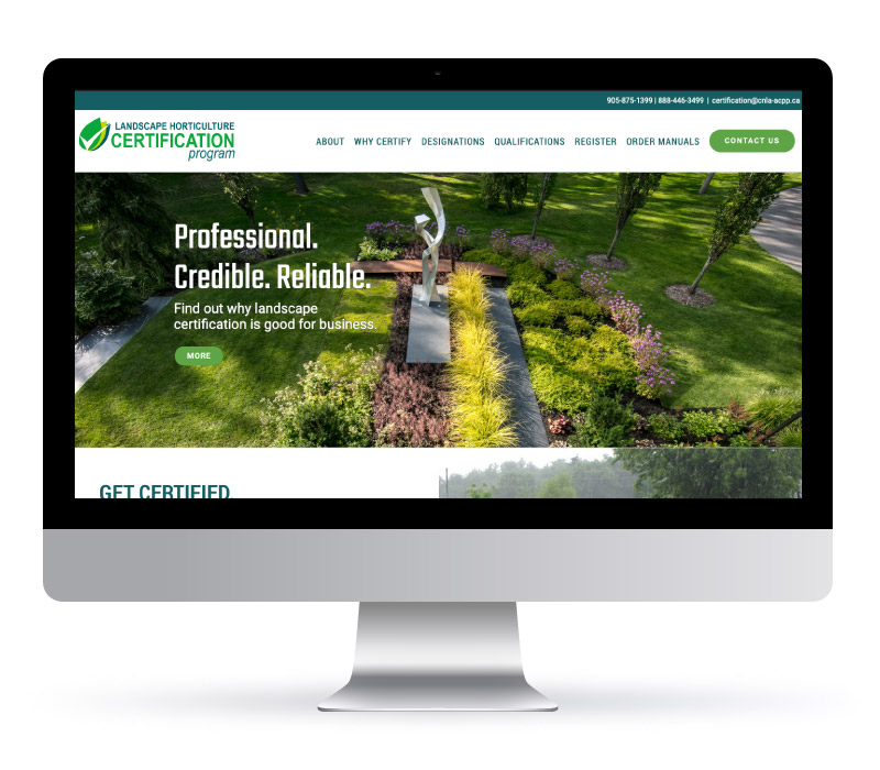
The client Landscape Horticulture Certification Program opted for the WordPress Everything Plan, which provides unlimited web pages and features a professionally designed, responsive layout tailored to their preferences. This plan includes comprehensive search engine and image optimization to improve the sites visibility and loading speed. We also integrated the client’s favourite images and videos, creating engaging sliders and graphics to enhance interactivity and visual appeal.

